Boxplots & the Five-Number Summary
Boxplots & the Five-Number Summary
Here is a data sample that we can use for this lesson:
5, 7, 11, 13, 17, 19, 23, 29, 31, 37, 41, 43, 47
Quartile
1. Arrange the data in increasing order and determine the median.
- The first quartile (Q1) is the median of the part of the entire data set that lies at or below the median of the entire data set.
- The second quartile (Q2) is the median of the entire data set.
- The third quartile (Q3)is the median of the part of the entire data set that lies at or above the median of the entire data set.
5, 7, 11, 13, 17, 19, 23, 29, 31, 37, 41, 43, 47
The median of the set is 23.
The first quartile of the set is the median of the first underlined portion: (11+13)/2 = 12.
The third quartile of the set is the median of the second underlined portion: (37+41)/2 = 39.
Interquartile Range
The interquartile range, IQR, is the difference between the first and third quartiles; that is, IQR = Q3 - Q1
The interquartile range of the set is 39 - 12 = 27.
The Five-Number Summary
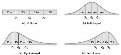
From the three quartiles, we can obtain a measure of center ( the median, Q2) and measures of variation of the two middle quarters of the data: Q2 - Q1, for the second quarter and Q3 - Q2, for the third quarter. But the three quartiles don't tell us anything about the variation of the first and fourth quarters. The five-number summary of a data set is: Min, Q1, Q2, Q3, and Max.
The five-number summary of the data set is: 5, 12, 23, 39, and 47.
Lower and Upper Limits
The lower limit and upper limit of a data set are given by:
Lower limit = Q1 - 1.5
IQR
Upper limit = Q3 + 1.5
IQR
Data points that lie below the lower limit or above the upper limit are potential outliers. To determine whether a potential outlier is truly an outlier, you should perform further data analyses by constructing a histogram, stem-and-leaf diagram, and other appropriate graphics that we present later.
The lower limit of the set is 12 - (1.5 27) = -28.5
The upper limit of the set is 39 + (1.5 27) = 79.5
Since there are no elements of the set less than -28.5 or greater than 79.5, there are no outliers.
To Construct a Boxplot
- Determine the quartiles.
- Determine potential outliers and the adjacent values.
- Draw a horizontal axis on which the numbers obtained in Steps 1 and 2 can be located. Above this axis, mark the quartiles and the adjacent values with vertical lines.
- Connect the quartiles to make a box and then connect the box to the adjacent values with lines.
- Plot each potential outlier with an asterisk.

Note: In a boxplot, the two lines emanating from the box are called whiskers. Boxplots are frequently drawn vertically instead of horizontally. Symbols other than an asterisk are sometimes used to plot potential outliers.
Example
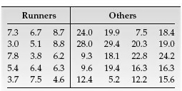
Researchers have measured skinfold thickness, an indirect indicator of body fat, from a sample of runners and non-runners in the same age group. The sample data, in millimeters (mm), presented in the table below, are based on their results. Use boxplots to compare these two data sets, paying special attention to center and variation.
Answer
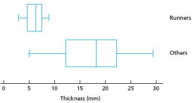
The figure above displays boxplots for the two data sets, using the same scale. It is apparent that, on average, the elite runners sampled have smaller skinfold thickness than the other people sampled. Furthermore, there is much less variation in skinfold thickness among the elite runners sampled than among the other people sampled. Additionally, when you study inferential statistics, you will be able to decide whether these descriptive properties of the samples can be extended to the populations from which the samples were drawn.
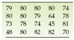
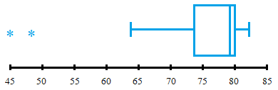
EXERCISES: For the data set below: (a.) Obtain and interpret the quartiles. (b.) Determine and interpret the interquartile range. (c.) Find and interpret the five-number summary. (d.) Identify potential outliers, if any. (e.) Construct and interpret a boxplot. The following table shows the number of games in which Wayne Gretzky, a retired professional hockey player, played during each of his 20 seasons in the NHL. Answers a. Q1 = 73.5, Q2 = 79, Q3 = 80. These are the values that mark off equally-sized portions of the data. b. IQR = 6.5. Half the data lies between the values of 73.5 and 80. c. 45, 73.5, 79, 80, 82. These values indicate wide variation in the first quarter d. 73.5 - 1.5(6.5) = 63.75, so 45 and 48 are potential outliers. e. The boxplot shows much less variation in the upper quartiles.