Lesson - Interpret and Create Graphs
Interpret and Create Graphs
Bar Graphs
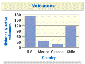
The bar graph below shows the number of historically active volcanoes in four countries. Which country has the most historically active volcanoes?
A bar graph is a type of graph in which the lengths of bars are used to represent and compare data in various categories.
Data is information, facts, or numbers that describe something.
Interpreting a Bar Graph
Use the bar graph about volcanoes to answer the question or explain why you can't answer the question using the graph.
a. Which country has the most historically active volcanoes?
Solution: The vertical axis in the bar graph is labeled "Historically active volcanoes," so the tallest bar represents the country with the most historically active volcanoes. Because the United States has the tallest bar, it has the most historically active volcanoes.
b. Which country has the most volcanic eruptions in a given year?
Solution: Having more historically active volcanoes doesn't necessarily mean having more eruptions, so you can't answer this question from the bar graph.
Examples
Use the bar graph about historically active volcanoes shown below.
About how many more historically active volcanoes does Chile have than Mexico?
About 80
Which country has the least number of historically active volcanoes?
Canada
Histograms:
When you have a large set of data to organize, you may be able to use a frequency table to group the data into intervals. The frequency of an interval is the number of values in the interval. You can graph data organized into equal intervals in a histogram. The height of each bar in a histogram indicates the frequency of an interval.
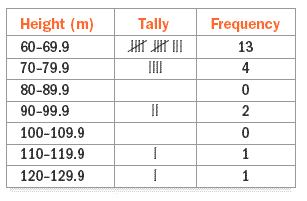
Making a Frequency Table
Roller Coasters
The data below shows the heights, in meters, of the tallest roller coasters in the world. Make a frequency table of the data.
66.4, 94.5, 68.3, 115, 62.5, 97, 66.4, 126.5, 63.4, 74.7, 63.4, 70.1, 66.4, 64.9, 63.7, 79, 63.4, 63.1, 62.5, 61.9, 71.6
Step 1 Choose intervals of equal size for the data.
Step 2 Tally the data in each interval. Use tally marks to record each occurrence of a height in its interval.
Step 3 Write the frequency for each interval by totaling the tally marks.
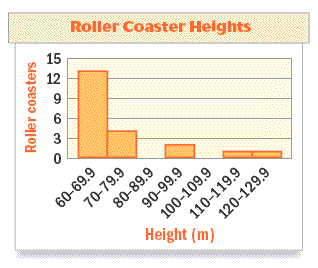
Making a Histogram
Make a histogram of the data shown in the frequency table.
Step 1 Draw and label the horizontal and vertical axes. Start the vertical scale at 0 and end at 15. Use increments of 3.
Step 2 Draw a bar to represent the frequency of each interval. The bars of neighboring intervals should touch.
Step 3 Write a title.
Which interval has the greatest number of roller coasters?
Practice
1. Use the graph below. It displays the number of times each country has won the World Cup in soccer (up to 2002).
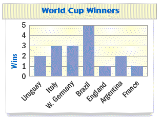
a) What type of graph is shown?
b) How many times had Italy won?
c) How many more times had Argentina won than France?
2. The histogram below shows the number of hurricanes in the Atlantic Ocean from 1950 through 1999.
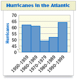
a) About how many hurricanes were there in the Atlantic Ocean from 1980 - 1989?
b) Can you determine the number of hurricanes there were in the Atlantic Ocean in 1965? Explain.
3. Use the bar graph below. It shows the number of businesses at a mall in various categories.
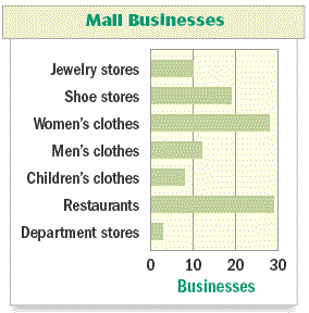
a) Which category has the greatest number of businesses?
b) Which category has the least number of businesses?
c) About how many more shoe stores are there than jewelry stores?
Answers
1. a) bar graph b) 3 c) 1
2. a) 52 b) No. A histogram shows information for intervals, but not individual data elements.
3. a) restaurants b) department stores c) 9