 Learning Target: I can figure out an approximate equation for the line of best fit in a scatterplot.
 Learning Target: I can figure out an approximate equation for the line of best fit in a scatterplot.
Approximating Lines of Best Fit
When you graph information on a scatterplot, the points rarely "line up" in a neat-looking curve; as the name of the graph implies, the points are more likely to scatter about. As a result, there is not usually a single line that passes through all of the data points. However, you can still find and study patterns in the data by finding the line that fits the points as closely as possible. This is called the regression line, or the line of best fit.
The line of best fit is a useful tool because it can give you a rough idea of where the data points have been and where they're going. You can use points on the line to make predictions about future data points.
Technology can give you this line rather quickly, as many spreadsheet programs such as MS Excel have features that can produce the graph directly from the data. However, there may be times where you need to approximate the line by manually drawing it.
Example 1
The data in the table show the forearm lengths and foot lengths (without shoes) of 18 students in an algebra class. After graphing these data points, draw a line that corresponds closely to the data. Write an equation of your line.
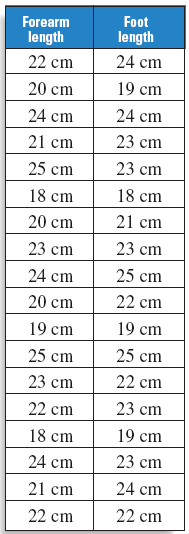
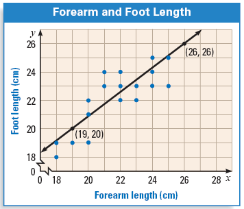
Let x represent the forearm length and let y represent the foot length. To begin, plot the points given by the ordered pairs. Then sketch a line that appears to best fit the points.
Reminder -- Finding the Equation of a Line
To find the equation of a line, you first locate two points on it. The equation of a line is typically expressed in the form y = mx + b, where m represents the slope of the line, and b represents the y-intercept, which is the point where the line crosses the y-axis. The slope is computed by dividing the difference between the points' y-values by the difference between their x-values. Once you find m, plug it into the equation along with the x- and y-values from either point, and use it to find b.
First, find two points on the line. We'll use (19, 20) and (26, 26) as shown. Compute the slope.
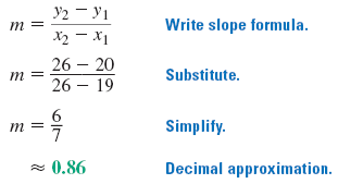
Now find the y-intercept of the line (b).
y = mx + b Write slope-intercept form.
20 = (0.86)(19) + b Substitute 0.86 for m, 19 for x, and 20 for y.
20 = 16.34 + b Simplify.
3.66 = b Solve for b.
Therefore, an approximate equation of the best-fitting line is y = 0.86x + 3.66. In general, if a student has a long forearm, then that student also has a long foot.
Example 2
Suppose a new student joins the class and has a forearm length of 17 cm. Use the information above to predict what the student's foot length will be.
We've already found the equation of the line of best fit: y = 0.86x + 3.66. We can use this equation to predict the new student's foot length. Remember that x represents forearm length and y represents foot length. So we're substituting 17 for x and using it to figure out y.
y = 0.86(17) + 3.66
y = 14.62 + 3.66
y = 18.28
Using the scatterplot, we can predict that the student will have a foot length of about 18.28 cm.
Example 3
a. The two graphs show the winning 100-meter women's freestyle swimming times and the winning women's long jump distances for the Olympics from 1948 through 1996. Which is which? Explain your reasoning.
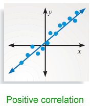
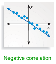
b. Describe the correlation of each set of data.
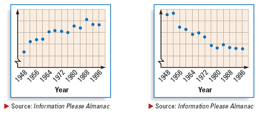
a. The first graph must represent the long jump distances because the winners tend to jump farther with each Olympic year. The second graph must represent the swimming times because the winners have tended to swim faster with each Olympic year, so their times have been decreasing.
b. The first graph shows a positive correlation between the year and the winning distance. The second graph shows a negative correlation between the year and the winning time.
Let's Practice Together
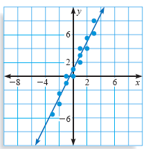
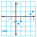
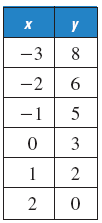
Estimate a line that corresponds closely to the data. Write an equation of your line.
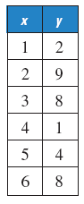
1. 
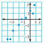
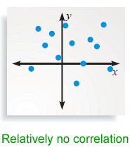
State whether x and y have a positive correlation, a negative correlation, or relatively no correlation. If possible, find an equation of a line that closely fits the data.
4. 
The mean base salary for players in the National Football League from 1983 to 1997 is shown in the scatter plot below. In the scatter plot, y represents the salary and x represents the number of years since 1980.
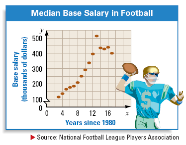
6. Find an equation of the line that you think closely fits the data.
7. Use the equation from exercise 6 to approximate the median base salary in the year 2010.
x 25 30 35 40 45 50 55 y 85 97 102 113 ? 136 144
Answers
(Equation coefficients are approximate. Your answers may vary.)
1.
2. y = x + 1
3.
4. relatively no correlation
5. negative correlation;
6. y = 25x + 50
7. $800,000
Check for Understanding
1. about 125